> Public Institution Website Renewal (Design Proposal)
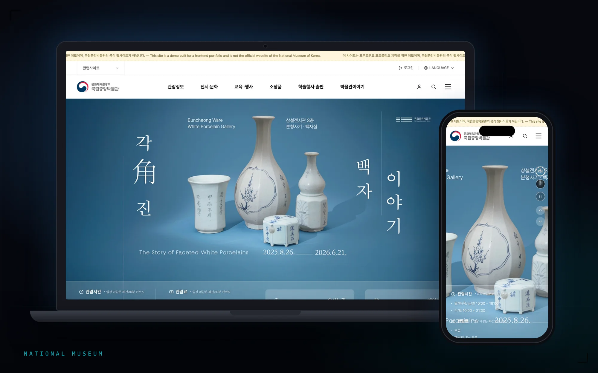
National Museum of Korea — Main Site Renewal
A renewal proposal improving the National Museum of Korea's main site — its home screen and GNB.
- Client
- National Museum of Korea
- Role
- Benchmarking100%
- GNB Design100%
- Main Screen Design100%
- Demo Site Build100%
- IAEstablished by the planning team
- Stage
- Proposal
- Skills
- Public SectorBenchmarkingGNB DesignVisual IdentityInteractive Demo
Challenge
There were, broadly, two reasons people came to the museum's homepage: to check visit info like hours and admission, or to see what exhibitions and education programs were currently running. On the existing site, both were scattered across several menus, so getting either answer took multiple trips through the navigation. At the same time, a museum homepage has to do more than deliver information — it has to carry the visual identity in the artifacts and exhibitions the institution actually holds. Lean on information alone and it reads like a government bulletin board; lean on visuals and the information people need goes missing. Striking a balance between access to information and visual polish was the real challenge.
Objective
Bring the scattered exhibition, event, and education info together and simplify the GNB, while still carrying the museum's own visual identity and the beauty of its exhibitions. To do that, I analyzed the information structure and key content through benchmarking, then designed the GNB and main screen. Rather than stopping at static comps, I built an actual working demo site, so interactions — like the info bar's color shifting with the main visual — could be checked directly. That made the design intent visible at a glance and let us reach agreement fast, grounded in the real flow instead of a still image.
Process
Before drafting the redesign, I analyzed six institutions' homepages — three domestic (Gongju National Museum, Gyeonggi Cultural Foundation, MMCA) and three international (the Louvre, the Met, the British Museum). I looked at three things: how each groups exhibitions, cultural events, and education together, how far each compresses its GNB, and what form its content takes.
Anyone can decide "the menu is too complex, cut it down." But how far to cut, and what principle to group by, needs evidence. Only after mapping the patterns that kept repeating across all six institutions did the proposed redesign actually become persuasive.
- 01GNB compression
Both domestic and international sites keep top-level menus to around 5 items to reduce cognitive load. The Louvre compresses to just three: VISIT / EXHIBITIONS AND EVENTS / EXPLORE.
- 02Tab consolidation
Rather than splitting exhibitions, education, and events into separate menus, switching between them as tabs inside one area read more clearly — more efficient than dividing the menu physically.
- 03Card-based UI
High-resolution image cards, not text lists, make content easier to tell apart at a glance — and each card marks its own status (running, open for registration, free/paid) clearly.
“Once you decide what to cut, information access and visual polish turn out to point the same way. Beauty isn't built by adding — it's closer to removing what gets in the way and letting what was already there come through.”